OVERVIEW
NOAA Fisheries UX Research
My role: UX Researcher
Client: Alaska Fisheries Science Center (a division of NOAA Fisheries)
Duration: six months
Objective: Evaluate user experience and usability of the National Marine Fisheries Service (AKA NOAA Fisheries) website. Assess functionality and content availability of website for Alaska stakeholders (including AFSC staff and environmental consultants).
Methods: user interviews, informal usability testing, affinity mapping
Tools: Audio Hijack, QuickTime Player, Adobe Premiere Pro, Miro, Google Docs, Google Meet

Organizational Research
What is the Alaska Fisheries Science Center?
The Alaska Fisheries Science Center (AFSC) is one of six science centers supporting NOAA Fisheries’ mission to:
Ensure productive and sustainable fisheries
Conserve protected species
Research from the AFSC informs stewardship of Alaska’s marine life and ecosystems, which support fisheries worth $1.8 billion.
Many of AFSC’s programs are concerned with conducting surveys to monitor populations of fish, marine mammals, and other species. Data products such as Stock Assessment Reports for specific species are used by AFSC staff as well as external stakeholders like the fishing industry, environmental community, Alaska Indigenous communities, state and federal government agencies, academic community, and others.
I worked as a member of the Communications (“Coms”) Program, whose mission is to promote and communicate the science being done at AFSC. This program is part of Operations, Management, & Information (OMI) Services, which is one of the Center’s 8 divisions:
Resource Assessment & Conservation Engineering (RACE)
Resource Ecology & Fisheries Management (REFM)
Marine Mammal Laboratory (MML)
Auke Bay Laboratories
Operations, Management, & Information (OMI)
Fisheries Monitoring & Analysis (FMA)
Office of Fisheries Information Systems (OFIS)
Habitat & Ecological Processes Research
Swimming in Acronyms
As a government organization, AFSC lives inside a complicated organizational chart and contains many programs distributed between 8 divisions.
I conducted organizational research during my first week in order to:
Understand the missions of each organization in the hierarchy (right), and
Become fluent in the acronym-heavy language spoken by AFSC staff

Web Transition
NOAA Fisheries headquarters was encouraging all science centers, including AFSC, to migrate their individual websites (AFSC Archive website, top) to the national NOAA Fisheries website (bottom).
This transition would standardize the online presence of science centers and ensure that all content is mobile-ready and 508-compliant.
The NOAA Fisheries website was built on Drupal and, while it is more modern, it introduces new conventions that have the potential to confuse stakeholders who are familiar with the old AFSC website.
This website transition sparked some questions…
Does the NOAA Fisheries site meet AFSC stakeholder needs?
Is it usable?
Does it have the content that stakeholders need?
Enter: UX Research!
All of these questions can be answered with a UX research study.
Study Objectives:
Understand what constituents want from website(s)
Discover if anything is missing from the NOAA Fisheries site
Collect System Usability Scale (SUS) scores for the NOAA Fisheries site

Methods
USER INTERVIEWS
USABILITY TESTING
I designed a UX research study consisting of user interviews with AFSC stakeholders followed by a quick, informal usability test. I wrote a discussion guide that would help me understand who my participants were, how they were connected to AFSC, and how the AFSC and NOAA Fisheries websites fit into their daily lives, with emphasis on their experience with the NOAA Fisheries website.
I also asked broader questions about participants’ mental models of how websites work:
How do you navigate and return to information on the web? (ex: bookmarking pages)
How do you expect to use a website?
These questions bled into the informal usability testing portion of the study. I asked participants to accomplish a task on NOAA Fisheries that they would typically need to complete as part of their job. These ranged from downloading raw data to finding contact information to reading general overviews of the science done in other divisions. In some cases, a participant was accustomed to completing this task on the old AFSC website, and I asked them to try to do it on the new NOAA Fisheries website.
My supervisor recruited participants who were familiar with the AFSC and NOAA Fisheries websites by asking for 2 volunteers from each AFSC division. We also wanted to include participants outside of the organization, since AFSC serves several stakeholders including the commercial and recreational fishing industry, environmental non-governmental organizations, academics, Alaska Indigenous communities, coastal communities, etc.
I ended up interviewing 8 AFSC staff members and 2 environmental consultants outside of the organization.
Quantitative Data
I closed 5 of my 10 interviews by collecting SUS scores for the NOAA Fisheries website.
Average SUS score: 61.5
What does this mean? In letter grades…(from Usability Geek):
80.3 and higher = A; “People love your site and will recommend it to their friends.”
68 = C; “You are doing OK but could improve.”
51 = F; “Make usability your priority now and fix this fast.”
So we could say that a score of 61.5 = D. This score is based on a small sample size, but it does indicate that the NOAA Fisheries has usability problems. But what are they? Let’s see what the people had to say…

Qualitative Data
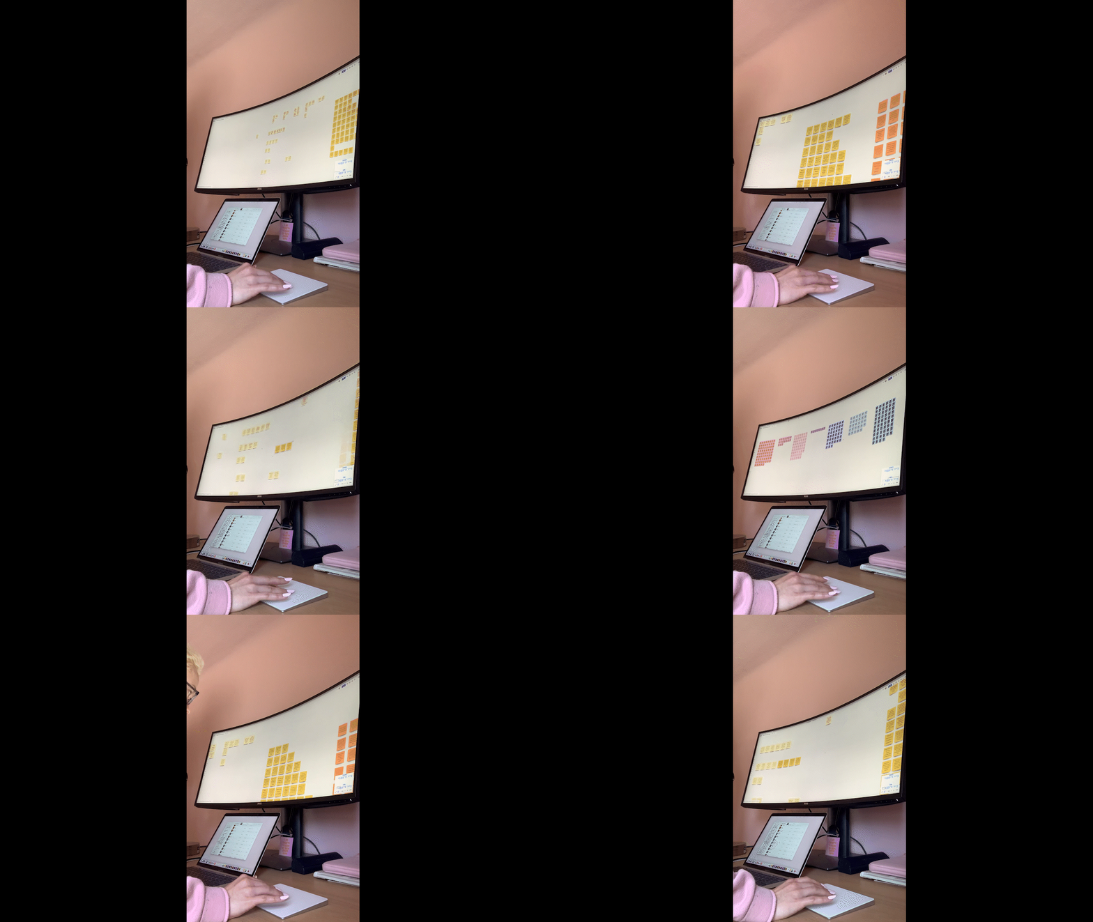
I recorded interview data on digital sticky notes and color-coded them by participant.
Each sticky note represented a piece of data: either a direct quote, a paraphrased statement, or an observed behavior during the informal usability test.
Synthesis
After lots of affinity mapping…
I synthesized interview data into over 70 “I” statements (for example: “I like the NOAA Fisheries navigation bar.”)
I did some analysis which boils down to:
How big are these groups? (How many data pieces contributed to this insight?)
How colorful are they? (How many individuals contributed to this insight?)
Based on this analysis and my intuition, I highlighted the most important insights.
I also noticed that 3 broad categories emerged:
Data & specific content
Information organization & navigation
Staff & contact information
So the most common challenges for users, and the primary tasks they wanted to accomplish, were centered around finding information.

Enter: Information Architecture!
Information architecture (IA) is amazing for solving these types of problems (and it’s also one of my favorite topics 🤓).
IA can be defined as “the art and science of shaping information products and experiences to support usability, findability, and understanding.”
- Rosenfeld, Louis, et al. Information Architecture: For the Web and Beyond
The AFSC and NOAA Fisheries websites are dynamic information environments, affected by context, content, and users.
Content includes documents, data types, formats, metadata, and volume. For example, NOAA Fisheries hosts web stories, PDF’s of Stock Assessment Reports, Contact Cards for staff, and much more. Some of this content can be tagged for internal and external search. There is a much larger volume of content on NOAA Fisheries compared to AFSC, since NOAA Fisheries includes every science center and regional office within it.
Context includes business goals, technology, and constraints. For example: the NOAA Fisheries site serves multiple audiences, including the general public. The site is hosted on a content management system called Drupal. Information-organizing processes such as tagging are subject to restrictions and may require permission or involvement from others in the organization.
When considering users, we want to know who the audience is, discover their tasks and information needs, and understand their information-seeking behavior. For example, NOAA Fisheries has different audiences including the general public, AFSC staff, and external stakeholders such as environmental consultants. Common tasks for AFSC scientists include finding raw data and contact information for staff in other divisions. They may use information-seeking behaviors such as internal search, external search (Google), browsing, or emailing a colleague to ask for information.
My project focused largely on the last piece: understanding users. Let’s dive in and see what I discovered!
Insights & Recommendations

“I don't get what I want or expect from NOAA Fisheries search results.”
This was a super common complaint. Problems with the search function may be a result of the procedure that content authors must use in order to tag pages for internal search. Content authors have to ask permission to add internal tags, but are allowed to tag for external search, so Google often does a better job at locating content than the NOAA Fisheries search. Users have noticed this and adapted their information-seeking behavior in response:
“I expect Google to work better than search functions elsewhere.”
“I search Google to find info on NOAA Fisheries.”
- a member of REFM
There was another big issue with search:
“We communicate using acronyms/abbreviations, but searching acronyms/abbreviations often doesn't work.”
Users said that staff talk almost exclusively in acronyms and abbreviations, but searching phrases like “tech memo” or “REFM” doesn’t return the desired results. It’s not intuitive or efficient for staff to type a long division name like “Resource Ecology and Fisheries Management” into the search bar.
Recommendations:
Re-evaluate tagging procedure
Include common acronyms and abbreviations as tags that internal search can recognize; “speak the same language” as staff
“I expect links to programs to lead to program landing pages, not search results.”
Users prefer to start at a landing page when they are exploring a program.
Walkthrough & Recommendations:

“I want a landing page for divisions and programs with relevant links and detailed info.”
The North Pacific Observer Program landing page could be a model for every program in every division. Users expect and desire program landing pages, similar to division landing pages. They expect to see:
Main functions of the program/division
Data, publications, reports, etc
Staff who work there
Recommendations:
Create landing pages for programs, similar to division landing pages and the NPOP page
Ask program staff what features and content they want on their page
Hierarchy & Mental Models
The desire for a landing page may relate to users’ mental models of AFSC and the larger structure of NOAA Fisheries in real life. Users seem to conceptualize the online homes of programs and divisions in relation to real-world organizational structure, and expect to find information by following a hierarchy:
“I see agency organizational structure reflected in website organization.”
“I can navigate more easily if I know the organizational structure of the website.”
“I expect larger categories to constrain subcategories.”
“I like to find info by starting with broad categories and narrowing down.”
Recommendations:
Landing pages for content (not just for programs and divisions); allow users to access all the documents related to a topic on one page
Include overview of the topic and links to relevant documents and data

“I don’t think NOAA Fisheries content is as useful for scientists as it is for the public.”
Users acknowledged that the NOAA Fisheries website serves multiple, very different audiences, and the general public is prioritized over employees.
Several users praised its layperson-oriented content, like the species descriptions under “Find A Species”. Users acknowledged that the NOAA Fisheries site is not meant to be a repository of documents for staff, and the average person probably doesn’t use the site to grab data. But some scientists and environmental consultants who work outside of NOAA Fisheries had unmet needs:
Content is missing or hard to find on NOAA Fisheries
Some data and documents from the AFSC website are missing from the NOAA Fisheries site
Users may try different information-seeking behaviors when they can’t meet their needs using the NOAA Fisheries or AFSC websites, requesting content from co-workers, principal investigators, or busy NOAA Fisheries employees and sharing files over email.
Recommendations:
Create opportunities (for example: a Google Form) for users to request specific data and content
“I want a staff directory with contact info.”
This was a BIG request! It was one of the three huge categories in my affinity map.
A primary task for staff using the NOAA Fisheries website is finding contact information. They seek staff emails, locations of labs, and an alternative to the intranet staff directory which is difficult to use and which lacks information on other science centers. Some users were based out of remote labs in Juneau, AK and lacked familiarity with other divisions and programs based in Seattle, WA. Others wanted to know who was employed in which program when they were trying to get hired at AFSC.
Nearly all of my participants wanted to know: who works in what group?
Recommendations:
A complete staff directory that shows which staff work in which group, and displays all the contact information that is appropriate for public viewing
Directory should also be accessible from landing pages for divisions and programs, and should indicate which staff work in which division and program

“I get lost on the NOAA Fisheries site.”
Whether they were seeking contact information, data, or monitoring reports, users said that they felt like they were going in circles.
Some related insights:
“I don't know how I got to this page.”
“I would normally go to the previous heading if I'm lost...one long link that would show the different levels you're on.” [Breadcrumbs!]
“I want link names to tell me where I'm going.”
“REFM headings [in search results] should be more descriptive, contain "contact" or "home page", to differentiate 1st and 2nd links...If there's no descriptor for these links with the same name, which do I click on?”
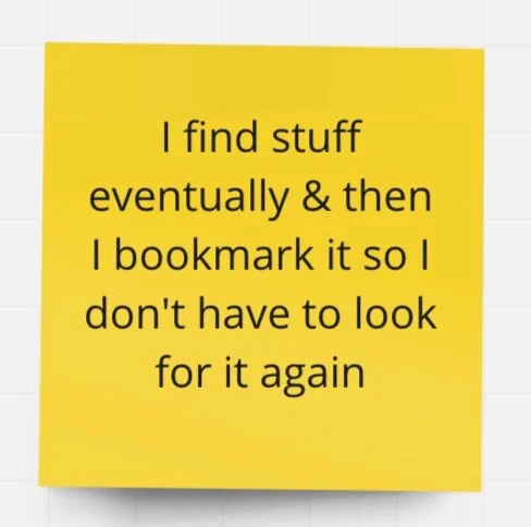
“I use bookmarks to return to pages I use often.”
Recommendations:
Consider adding breadcrumbs
Re-evaluate link names: are they descriptive? Do links to different URLs have identical names?
Next Steps
If I had more time, I would…
Talk with a wider variety of users. I was only able to interview AFSC staff and two environmental consultants, but initially I also wanted to interview other stakeholders:
Commercial & recreational fishermen
Environmental non-governmental organizations
Resource managers
Alaska Regional Office staff
North Pacific Fishery Management Council members
Alaska Indigenous communities
Coastal communities
Academics (Universities of Alaska & Washington)
Create personas for major user groups; for example, The AFSC Scientist, The Admin, The Environmental Consultant, etc. Include information on each persona’s behaviors, tech usage, workflows, motivations, attitudes, pains and needs.
Conduct card sorting to learn more about how users categorize and label information.
Use sitemaps, user flows, and other tools to better understand the information architecture of NOAA Fisheries.
Does the NOAA Fisheries site deliver a coherent experience across channels? This project only dealt with the desktop site. What about the mobile version? How do navigation systems change or remain the same?
Think more about organization schemes and how they might conflict. Website organization and hierarchy that is division-based, center-based, location-based, keyword-based, etc...may conflict. For example: Auke Bay Lab can be “filed” under Locations (location-based) or under Divisions (org-structure-based).
Conduct formal usability testing for NOAA Fisheries website.

Results
“Signe is an insightful researcher and a dedicated creative professional. Her passion for science, science communication and UX Design—coupled with the richness and quality of her work—make her uniquely suited to build indispensable bridges. Her presentation style is accessible and illuminating and her work provides clarity on both existing issues and opportunities for growth. Furthermore, she brings a warm and delightful spirit to every meeting. Our NOAA AFSC team will really miss all of her contributions. Signe will be an incredible asset in any UX or communications team.”


