Bridal Dashboard
My role: Visual Designer
My team: Siqi Chen (Information Architect), Thomas Nielson (UX Researcher)
Client: Grace + Ivory
Duration: Three weeks
Objective: Design a high-fidelity mockup of an interactive bridal dashboard to streamline the wedding dress purchasing experience of Grace + Ivory brides and reduce margins of error.
Results: Clean, user-friendly, intuitive, and aesthetically appealing dashboard. Client plans to implement the design onto their website. System usability score of dashboard design was 15 points higher than that of current website.
OVERVIEW

What is Grace + Ivory?
Grace + Ivory is an online bridal retailer offering an alternative to traditional wedding dress shopping. They sell affordable, made-to-measure, customizable wedding dresses. Through Grace + Ivory’s Try-at-Home program, brides can order dress samples to try on at home.
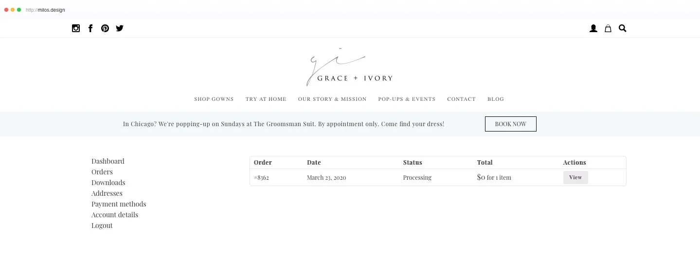
The existing dashboard on graceandivory.com (above) contained only basic account and order information. Our client wanted a dashboard where brides could share and save information that was currently managed through email, especially:
Measurements
14 to 15 measurements are needed to tailor a wedding dress. Entering them correctly and recording them in the appropriate document are opportunities for error.
Goal: inputting and submitting measurements integrated along with measurement guide.
Wedding Dress Agreement
Contains policies and customization options.
Goal: part of dashboard, instead of a Word document sent through email.
Visual Design
When I first explored graceandivory.com, I noticed that they had already crafted an appealing and sophisticated aesthetic.
While my teammates prepared for user research, I gathered assets, fonts, and colors and compiled a style guide that I could reference later in the design phase.

Persona & Storyboard
We synthesized insights from user research into a persona, Natasha.
Thomas spearheaded user interviews with five women, ages 25 - 35, who had experience with weddings and wedding dress shopping.
We learned…
Brides value simple and clear communication
It is difficult to trust their own measurements
They don’t want outside influence on their dress decision - however, service in the bride’s best interest is valued
The online experience needs to inspire trust
I created a storyboard (below) to give life to Natasha’s story.
Design Studios
We completed three rounds of design studio sessions, wireframing, and usability testing, increasing fidelity and improving usability in response to user feedback.
Round 1
We visualized our abstract ideas by sketching and brainstorming during design studio sessions. In the first session, we used insights from user interviews to create the basic elements of our design.
Low-Fidelity Wireframes
I synthesized our ideas into low-fidelity wireframes and a prototype that allowed us to test basic functions.
Tools: Sketch and InVision.
Usability Testing
From our first round of usability testing, we discovered confusion with the dashboard’s navigation and functionality.
“I would think the dashboard is more than just orders…”
“I would like to know the status to make changes early.”
This led us to a second design studio…

Round 2
In this design studio, we focused on user flow and interactions. We responded to user feedback by adding information on dress status and including a home page to clarify that the dashboard includes more than just order information.
Sketches by Thomas and Siqi.
Wireframes v2
I incorporated these ideas into our second iteration. These wireframes included a “chat with my stylist” feature, plus a progress bar that tracked the dress purchasing process. We also tried putting navigation at the top.
Usability Testing
We did more user testing. One user asked,
“Is this a tool for a dress or for a wedding?”
This made us reconsider the scope of our project and consider…
What are we making this dashboard for?
What are the key features and functions, and how can we make them easy to use?
We had been designing social features, but were these important for Grace + Ivory and
its clients?
We realized we needed to optimize the most important features, like “My Measurements” and signing the Wedding Dress Agreement, since usability testing showed that these were confusing to users.
Round 3
In our final design studio we cut the social features, thinking instead about the dashboard’s layout and different ways to keep brides informed and excited about their dress. These designs revolved around streamlining and clarifying the dress purchasing process.
Sketches by Thomas and Siqi.
Wireframes v3
The following iteration was higher fidelity, incorporating more colors, images, and the real wedding dress agreement document. We removed social features and experimented with two sections on wedding dress planning.
The first was like a virtual fitting room where clients could add measurements, post photos, and chat with their stylist.
The second was a tab for “My Wedding Dress Journey”, where clients could see more formal aspects of their wedding dress process.
Usability Testing
“This is not what I imagine a dashboard to be.”
Despite our efforts, the design still didn’t match users’ mental model of a dashboard. We realized that we had too many tabs and elements competing for attention. A dashboard should be simple, like a control panel where clients could have everything they need most at their fingertips.
The most important change we made in the following iteration was simplifying the design and rethinking its structure. We transformed the dashboard from a collection of 6 subpages into a single page.

Results
The System Usability Scale (SUS) is a 10-question survey that provides a quick way to measure usability. Thomas gathered SUS scores from usability test participants for iterations 1 through 5 of our dashboard prototype, and the score increased as we iterated on our design.
Our client was impressed with our final product and put us in contact with their developers to discuss hand-off. We collaborated with two web developers to discuss feasibility and implementation of our design, and they said that most of the features were doable. They planned to integrate our dashboard concept on the Grace + Ivory website in the coming months.
Before & After
The original dashboard (above) only contained account and order information.
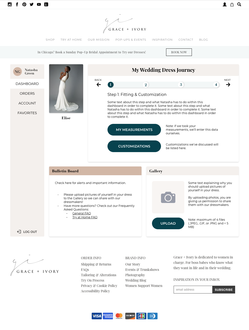
Our dashboard design (below) retains the simplicity of the original, with some additional, carefully selected features:
My Wedding Dress Journey, a progress bar that keeps users informed and on track in their dress purchasing process
My Measurements, where users can upload and view their measurements
My Wedding Dress Agreement, where users can view and sign this document
Gallery, where users can upload photos of themselves in their dress to help with customization and to share with dressmakers
Bulletin Board, a feature specifically requested by our client, where alerts and important information live
Solo Redesign
A year later, I revisited this project. I received some suggestions for how to improve the visual design from a recruiter and two mentors:
Consider color, typography, shape, and visual hierarchy
Make buttons and form fields look more conventional
Smooth out hard lines in the checkout order flow
Make the dashboard look less basic
Double-check my grid
In addition to improving aesthetics, I wanted to make the dashboard more streamlined. I reduced the amount of information shown on the main page of the dashboard at one time by displaying only the content and features that were needed at each step of My Wedding Dress Journey, but also allowed the user to access all the information by navigating between steps.
I also addressed some feedback from our final usability tests:
“I want to see my dress right away.”
“I would like to input measurements from My Wedding Dress Journey.”
“I would like confirmation that measurements are saved.”
Colors
Tina had wanted to maintain her brand’s current messaging, feeling, and colors, and flow with her current theme. I worked within the original palette, but reconsidered the meanings I would assign to colors. I evaluated color contrast and accessibility using the Accessible Brand Colors tool by Use All Five, which shows the ADA compliance level of each possible color combination (below). (Shout out to my friend Nina for showing it to me!) I chose dark teal as the CTA color for buttons since it popped against light background colors, with very high AAA compliance levels.
Typography
I revisited graceandivory.com and saw that they had swapped the typeface of their global header from Playfair Display to a sans-serif font called Montserrat. Sans-serif fonts are clearer to read, especially when text is small, so I used this new font liberally throughout the dashboard. I retained Playfair Display and Bauer Bodoni Std as headers to maintain the elegant vibe that they contribute to Grace + Ivory’s branding.
View the interactive prototype or watch the walkthrough (below), designed for a user flow in which our persona Natasha has tried on a wedding dress at home, decides to purchase it through the Orders tab, and moves through her wedding dress journey.

Results
“The design is clean, user-friendly, and intuitive.”
“Signe has great attention to detail and is very receptive to feedback. I worked with Signe for three weeks while she designed a bridal dashboard for graceandivory.com. Signe surpassed my expectations…[she] produced a high-fidelity, interactive prototype that was both usable and beautiful. We look forward to implementing her group's design for Grace + Ivory. I would love to work with her again!”
— Tina Wong, Founder at Grace + Ivory


